
Art Direction · UI Design · UX Research (contrib.) · E-commerce
Aromateque — a selective-perfumery store that finally feels like the boutique.
A scent you can't smell online has to earn trust on every screen. A research-led redesign of Ukraine's selective-perfumery retailer. I led the UI and worked hands-on in the team's research; the store was rebuilt around three moves — inspire, educate, convert — from an editorial home to a product page that explains the scent.
Background
A boutique of rare scents, sold through a plain catalogue.
Aromateque is Ukraine's home of niche fragrance and luxury beauty: official distributor of 120+ brands, 16 boutiques in 8 cities. Offline it is a ritual — rare bottles, expert consultants, time to choose. Online it was a novelty homepage in front of a plain catalogue. In a category you can't smell online, that gap costs sales, not just looks.

Challenge
Three fears. One shopper who can't smell the product.
- Trust leaks. Many shoppers didn't know Aromateque is the official distributor — buying abroad felt safer.
- Prices and loyalty feel opaque. Bonuses, prices and payments came up again and again in support calls.
- Nothing helps you discover. The site found what you already knew; it never explained a scent or a brand.
Discovery
149 people, 25 calls, 6 interviews, 4 competitors.
The work started with research, not screens, and I was hands-on in it with the team: a competitor scan (Makeup, Bomond, Parfums, Sephora), an online survey of 149 people, 25 real support calls broken down into 19 distinct pains, and 6 in-depth interviews. Shoppers ranked exclusivity and originality as the store's top value — and a full description, composition and proof of authenticity as the product info they need most.
| Who | Wants | Fears | Job to be done |
|---|---|---|---|
| Victoria, 33 · marketer | Exclusive finds, new brands, the "special occasion" feeling | Unclear prices and loyalty | Re-order fast, pick a gift quickly |
| Lyudmila, 42 · legal director | Niche scents, time among beautiful things | Thin descriptions, missing brands | Choose an anniversary gift by notes and story |
| Valery, 37 · restaurateur | Premium brands, attentive service, fast delivery | "Is it authentic?" | A one-click gift order, delivered fast |
Thinking
Inspire, educate, convert — each move answers a fear.
One strategy in three moves, with trust built into every screen. The new structure was then mapped end to end as grey wireframes and a clickable prototype: 60 screens and states, including 14 drawers and modals and 10 system states.
| Move | In the store | Fear it answers |
|---|---|---|
| Inspire — feel it | Editorial home, beauty-stylist picks, brand of the week, magazine | "The site isn't enjoyable to spend time on" |
| Educate — learn it | Head, heart and base notes, perfumer, story, formulation, brand pages | "Descriptions aren't informative enough" |
| Trust — prove it | Authorized-distributor badge, warranty, audit report, store availability | "Is it authentic?" |
| Convert — come back | Status level, bonus balance and history, wishlists, fragrance collection | "Unclear how the loyalty programme works" |


Outcome
Every screen answers a fear.
The product page carries the most weight: it has to sell a scent the shopper can't smell. It answers two questions at once — what am I buying, and can I trust this store?
| Part | What it does |
|---|---|
| 1 · Buy panel | Size and price, Add to bag, one-click buy, interest-free payments. "Authorized distributor", bonuses, warranty and delivery sit next to the price. |
| 2 · Notes | Fragrance family plus head, heart and base notes — readable in seconds. |
| 3 · Story | The story of the scent, the perfumer, year, country, collection and full formulation. |
| 4 · Film & pairing | A product film and "Frequently bought with". |

A gift in one click
For the shopper who gifts often, one-click buy opens a short drawer instead of a checkout. The confirmation promises a call within 15 minutes, with a way to change the number or cancel.

Discovery
Filters by notes, fragrance family and profile, active-filter chips with Clear all, and a way out when nothing matches. Brands A–Z, brand pages and the magazine turn browsing into learning.

Checkout
Three steps with the order summary always in view, and the hotline and chat on every step.

Coming back
The account shows your status, your bonus balance and every accrual and spend. Named wishlists, a personal fragrance collection and back-in-stock alerts give a reason to return.

Design system
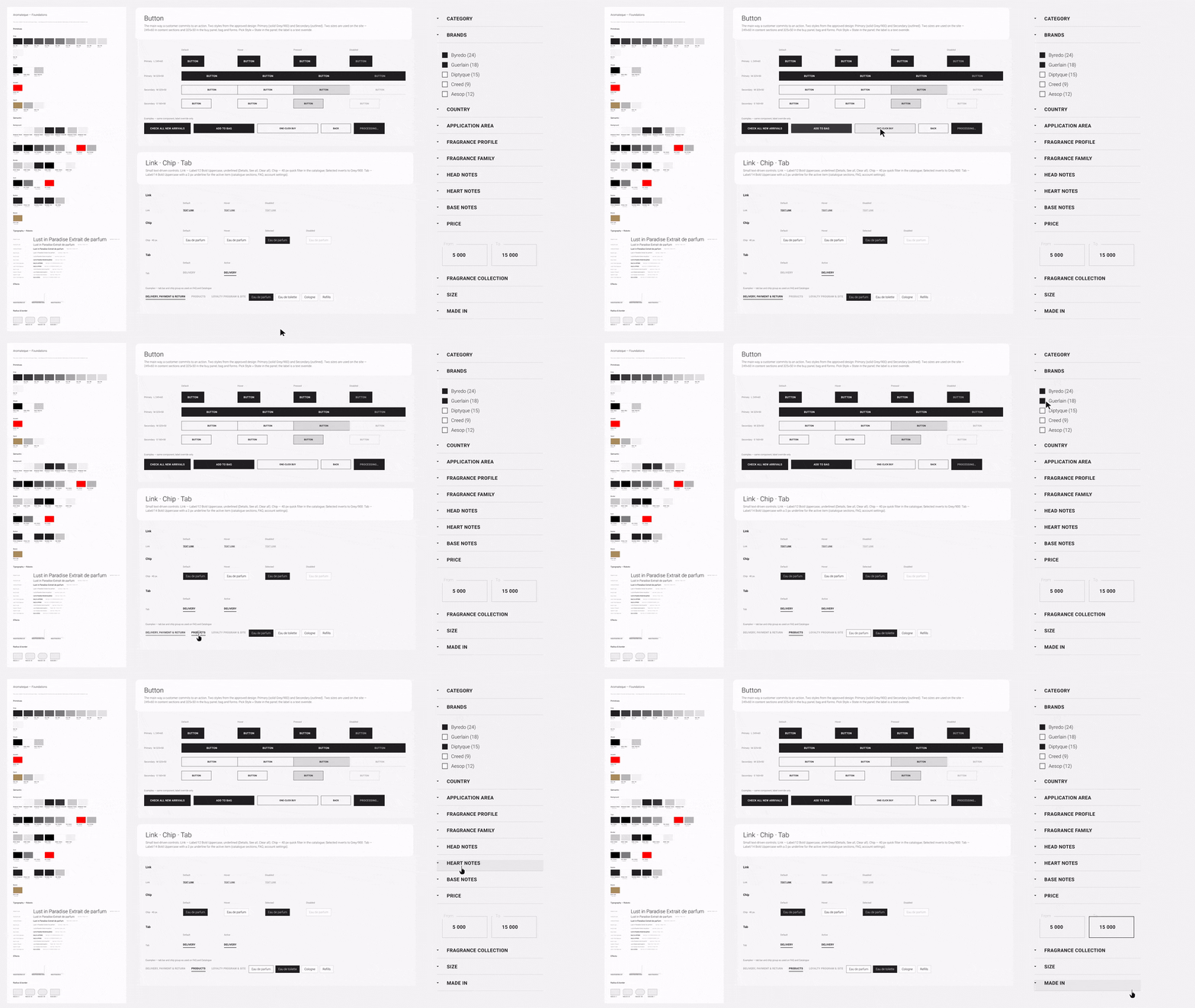
One UI kit behind every page: product cards in two sizes, buttons, chips, filter rows, size select, inputs, drawers. A quiet palette, so the product photography does the talking.
What shipped
Results
The store got smarter — the atmosphere shipped only in part.
The live store kept the pillars: beauty-stylist articles and a magazine, brand storytelling, fragrance-group filters, a product page with notes, perfumer and story plus one-click buy, and strong authenticity signals — official distributor of 120+ brands, an audit report, cashback, same-day delivery in Kyiv. What didn't ship is what made it feel like Aromateque: the editorial atmosphere, self-selected samples, wishlists and the fragrance collection. The live site is a leaner, more conventional store than the design.
Grounded, not guessed
149 survey answers, 19 pains from 25 calls and 6 interviews became 3 personas, JTBD and a UX strategy.
What it showed→What it showedThree fears behind most of the pain- Many didn't know Aromateque is the official distributor
- Bonuses, prices and payments were unclear
- The site found products but never helped discover
- Top value: exclusivity and originality
- Most-wanted info: description, composition, proof of authenticity
Heuristic evaluation
Nielsen's ten on the final design, 19 screens. 23 findings — 3 high, 12 medium, 8 low — all fixed in the design and the prototype.
What was fixed→What was fixedThe three high-severity findings, fixed- Checkout asked for a street address on store pickup → fields now follow the delivery method
- One-click buy labelled the phone field "Surname" → "Phone"
- Bag, drawer and checkout totals didn't reconcile → one order summary everywhere
- Also: loyalty numbers got units, one currency format, counters on the bag and wishlist
Trust, surfaced
Authorized distributor, warranty, bonuses and delivery sit next to the price, not in the footer.
Where it lives→Where it livesAnswers the fear "is it authentic?"- Authorized-distributor badge on every product page
- Warranty and delivery beside Add to bag
- Store availability before you travel
- Audit report linked from the footer
One coherent system
60 screens and states on one UI kit, with a new IA behind them.
What it covers→What it covers60 screens and states- Main flow: home to order placed, 12 screens
- Account & stores: 11 screens
- 14 drawers and modals, shown in context
- 13 info and content pages
- 10 system states: 404, 500, empty, recovery, tracking
Next chapter
- Make samples self-serve. The strongest lever for a product you can't smell online.
- Bring back discovery. Wishlists and the fragrance collection give people a reason to return.
- Instrument loyalty. Measure whether clearer levels and bonuses lift repeat purchases.
Every number here comes from the research. No sales data was shared, so no conversion figures are shown.
Selected screens
The store, end to end — on one editorial UI kit.


